Volunteer UX: The #1 Key to Deeper Engagement
If you’re looking for the key to better retention and deeper volunteer engagement, it won’t be found through some outside source or “miracle cure.”
It won’t be solved by a better policy or procedure (although these can help). Nor, will it be because you added one more form or hurdle to your application process. It won’t even be because you reduce the ratio of staff to volunteers.
None of these are remedies to reduce the staggering amount of volunteer disengagement and turnover that plagues so many organizations.
No, what can help you deepen your connections with volunteers and keep them coming back can be found right in front of your nose. It’s been there all the time, waiting for you to notice.
It is … the volunteer user experience, or what we like to call the “Volunteer UX.”
Volunteer UX — The #1 Key That Unlocks it All
For years now, academic researchers have made this point — If you are concerned about acquiring and maintaining a robust pool of volunteer talent, it’s more important what’s done FOR and WITH volunteers that is what is done TO volunteers. It’s a subtle, but critical distinction.
In the most simple terms, higher volunteer participation rates aren’t the result of the paperwork and processes organizations work so hard to develop and refine (those are great for managing programs, but not for leading volunteers).
Rather, the depth of involvement is directly related to the sum total of all volunteer encounters with your organization — past, present, and future.
Every “touch point” in their journey results in an impression. Each is emotionally charged — either to the positive or to the negative. When the negatives outweigh the positives, engagement falters. It’s pretty much that simple.
Does this mean human resources policies and procedures have no place in volunteer organizations? Not at all. These serve vital functions for the organization — managing risk, tracking impact, aligning resources, reducing departmental silos, establishing standards, and managing staff performance to name a few
But, none of these important administrative tools directly impact whether or not a volunteer has the wherewithal to overcome their own personal barriers to participation.
Instead, what truly inspires community members to “run the gauntlet” of many a nonprofit’s onboarding process is how it makes them FEEL.
Remember Their Emotions
Right now, we are in the midst of a terrific time of opportunity for organizations. There has been a wave of community participation that holds promise and untapped potential for the future.
Volunteer rates are at an all time high, as citizens seek to get involved in change for the better. In the US, nearly one in three adults volunteer, a rate that we haven’t enjoyed in this country in over a decade. What’s more, over a third are engaged in fundraising activities and donate at twice the rate of non-volunteers.
But, what happens when an eager supporter hits the proverbial “brick wall”? When their experience doesn’t match their expectations? When they are thrown into their role to sink or swim? When they find themselves in the midst of unresolved conflict or a poor team culture? When they are expected to appear at the drop of a hat, but aren’t considered a priority for leadership? When they are treated as an add on — nice to have, but not essential?
These experiences take an emotional toll, and emotions lead to beliefs and beliefs to actions.
So, do they quit this particular organization. Or, do they quit volunteerism altogether?
Can the nonprofit sector afford to gamble on the outcome? Or, would volunteer organizations do better by taking a more purposeful approach to improving Volunteer UX?
The Basics of UX

The good news is that if we want to build the momentum for greater nonprofit impact through better Volunteer UX, there already exists a wealth of research and best practices on user experience.
Although UX was initially a conceptual framework developed for software engineers and web designers, there’s plenty from which to glean insight. Because users interact with products and services in the digital space, designers have been able to test and make improvements based on hard data (opens, clicks, conversions, etc.). This has led to the development of a body of knowledge around usability we can tap. This, combined with the fact that today’s volunteers most often make initial contact with organizations via digital means (email, mobile, web), makes UX worth exploring.
UX Defined
The Nielsen Norman Group, leaders in user experience research, define UX succinctly — “‘User experience’ encompasses all aspects of the end-user’s interaction with the company, its services, and its products.” They go on to simplify even further — “The first requirement for an exemplary user experience is to meet the exact needs of the customer, without fuss or bother.”
UX is not to be confused with UI or User Interface. CareerFoundry, a training hub for digital designers, described the difference, “If you imagine a product as the human body, the bones represent the code which gives it structure. The organs represent the UX design: measuring and optimizing against input for supporting life functions. And UI design represents the cosmetics of the body–its presentation, its senses and reactions.”
In other words, UX design is a “human first” focus on the journey of the customer, their emotions as they interact with a product or service and attempt to solve a “problem” or meet a need. It focuses on the psychology of the customer. The more easy and hassle free, the better the user experience.
UI design focuses on the visual interface and communication elements that facilitate the user experience — the ease of search and navigation, the check out process, etc. UI focuses more on graphic and web design (e.g., how a website looks and feels).
While UX focuses on human performance or how the user feels throughout their journey, UI is how all about how visually appealing and functional the (most often digital) interface is.
Both go hand in hand for a better result. Without good UI, UX probably won’t be that great for your customer. And, without a good UX framework, the UI won’t be focused on helping the customer reach their goal.
UX for Volunteer Organizations
So what do UX and UI have to do with volunteer engagement? For one, they offer fresh frameworks for diagnosing and addressing barriers to deep volunteer involvement from a “people first” perspective.
If we can better understand the volunteer journey — from first touch to fond farewell — with a greater sense of empathy and a refined focus on volunteer needs, we can increase satisfaction and retention rates and perhaps even deepen the engagement of our most valued supporters.
With more careful consideration of design elements in our volunteer recruitment landing pages, application forms, training portals, reporting tools, etc. we can ensure that volunteers follow through on their intentions and commitment to serve, rather than being stymied by poorly designed systems and software.
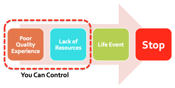
The UK’s Pathways Through Participation research explored the factors that shape civic and volunteer participation. They found that volunteers stop participating for three main reasons — 1) a poor quality experience, 2) a lack of resources, or 3) a life event. Two of the three can be tackled head on through better Volunteer UX.
Why Volunteers Stop

Certainly, Volunteer UX must balance the needs of the volunteer with the needs of the organization and its goals. We can’t promise that nonprofit work will be easy, or that we can do away with all requirements that protect volunteers and those they serve, or that the focus must remain firmly on the mission. It’s simply not practical.
But, what if we took pains to map out the volunteer journey and optimize it at every step? What would it mean to your organization if volunteers encountered a more friction-free experience? Would the investment of time and resources be worth it?
What would it mean to volunteerism as a whole if every nonprofit took Volunteer UX design seriously?
Stay Tuned for More
How your supporters experience service with your good cause has everything to do with whether they will stay or go. So, designing exceptional experiences, not more paperwork, will be what helps you get traction.
We think this topic is the lynchpin to success, so we’ll be writing more on the concept of Volunteer UX in future blog posts. Stay tuned for more!


