 How to Engage Volunteers with a Volunteer Website that Converts
The volunteer recruitment or “get involved” page on your nonprofit’s volunteer website is your most important tool to engage your community. So, it makes sense that it is designed purposefully.
A well-built page has the power to spark action and convert browsers to inquirers and inquirers to joiners. But it must be designed to do so.
Unfortunately, most web pages are poorly designed and don’t inspire action. Luckily, your agency can use best practices in online marketing without spending a lot of extra money or time.
In this post, we’ll break down exactly what you should include on your page to create an exceptional user experience that boosts conversions and helps grow the number of volunteer applicants you get each month.
Your Volunteer Website is Your Most Powerful Asset to Engage Volunteers
Your volunteer recruitment page, or “landing page,” is the most important online marketing tool you have at your disposal. It is the hub page to which you send visitors via your key digital marketing channels. It is also the place you can begin to build a list of contacts who are interested in your opportunities.
Are you confused by the term “digital marketing”? Don’t be.
Digital marketing is simply a kind of marketing that uses online tools or channels to reach an audience. These channels might include social media, email, text messages, website notifications, search engines (like Google), online news releases, e-newsletters, webinars, postings on other websites, blogs, podcasts, or other pages on your website.
Digital marketing is similar to traditional outreach and marketing, except that it uses online tools. While traditional marketing uses fliers, newspaper or magazine advertisements, direct mail, billboards, radio and TV advertising, paper newsletters, and phone calls, digital marketing relates to anything you do online.
For more detail about digital marketing and how it relates to volunteer recruitment, check out our blog post on how to develop a volunteer recruitment plan using digital marketing.
In today’s world, digital marketing trumps traditional marketing because of one simple technological advancement – the invention of the smartphone.
Nowadays, much of how the public gets information is through their phone and online participation rates are only growing. From 2012 to 2018 the total daily amount of adult time spent on a mobile device in the US jumped from 88 to 203 minutes a day. And, it is estimated that by 2025 nearly three quarters (72.6 percent) of internet users will access the web only via smartphones.
So, if you want to meet volunteers where they’re at, you much do so online. And not only must you have an online presence, but you must also provide the right kinds of information. Consumer expectations are high, with 75% of users expecting immediate information when they browse from their phones.
So, having a well-designed and informative volunteer recruitment landing page can go a long way in communicating with and engaging new volunteers. In fact, it is your best bet in today’s world.
The Anatomy of a High Converting Volunteer Recruitment Page
Below are the basic elements of an engaging volunteer landing page that inspires action. It takes the reader through a step-by-step process of commitment by appealing to both their emotional and informational needs.
When designing your page, take the perspective of your reader. What information are they most seeking? What are their primary concerns? How will they evaluate your opportunities? What is most important to them (not you)?
4 Key Elements of an Exceptional Volunteer Engagement Page
Below are the key things you should include in your
1. A Strong Hero Image, Header, and Sub-Header
When new visitors come to your web page, they are seeking confirmation that they are in the right place. They want to know, on a gut level, that they belong.
The best way to build a sense of belonging and ease is through the image you include at the top of the page. It should feature the smiling faces of volunteers close up, not in a large group where you can’t see emotions. People should be having fun.
Consider the combination of image and text your welcome mat. What does it immediately say? What first impression does it give?
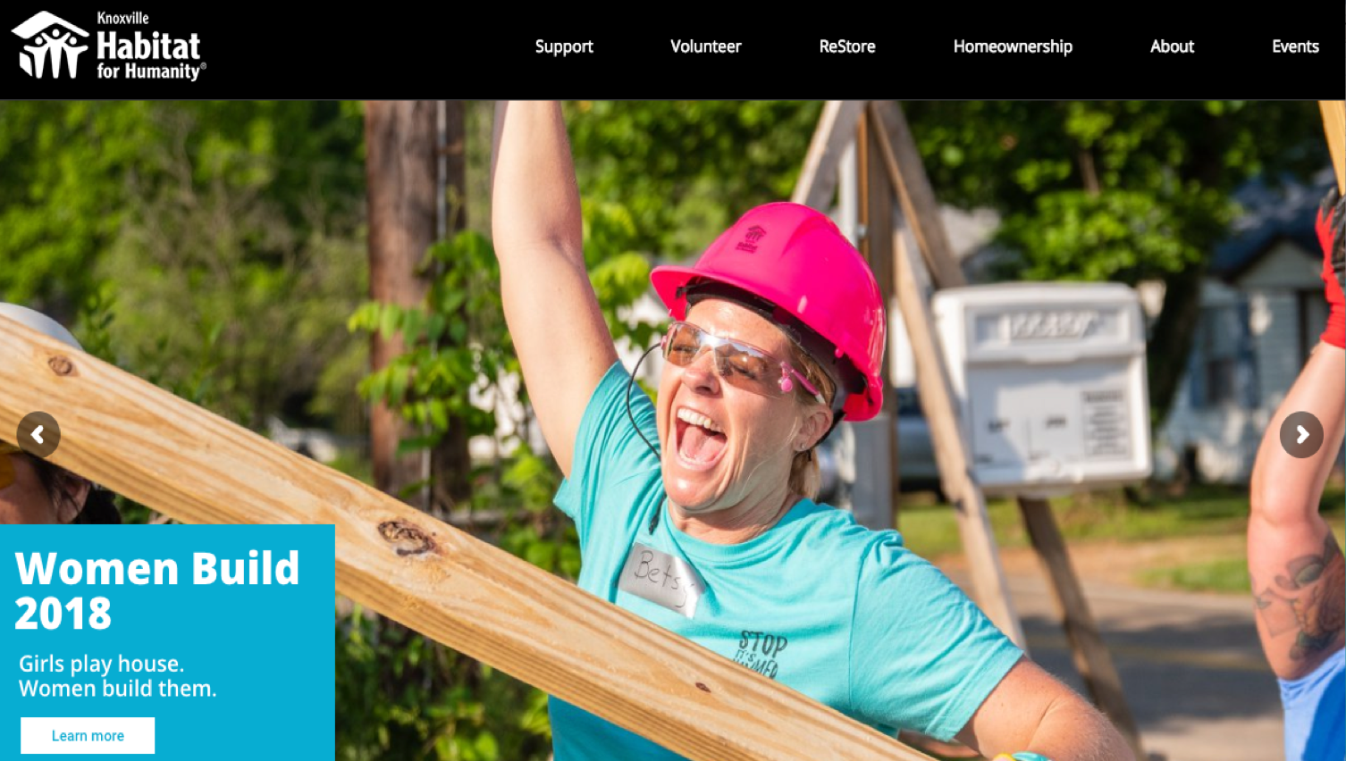
Your title and subtitle should inspire action. Check out the following hero image from Knoxville Habitat for Humanity. Is this volunteer having fun? And, check out the copy – “Women Build 2018: Girls play house. Women build them.” It challenges volunteers to become better versions of themselves. Pretty catchy and inspiring.
2. Elements That Build Trust
When new visitors come to your web page, they are also seeking confirmation and proof from others that your organization warrants your trust. In today’s world, simply being a nonprofit or public sector organization that engages volunteers is not enough.
Your visitors need to hear from others that will vouch for you and hear from you as authentic, caring people who are making a difference.
Below are a few different trust-building elements. See if you can include at least two on your page.
- Testimonials – from real volunteers about their experience, with photos
- Ratings & Comments – both the good and not so good
- About Us – your leadership team (even if it’s a team of one), with a photo
- Proof You Make an Impact – a few statistics can influence, but endorsements of those who’ve been impacted by your work pack a more powerful punch
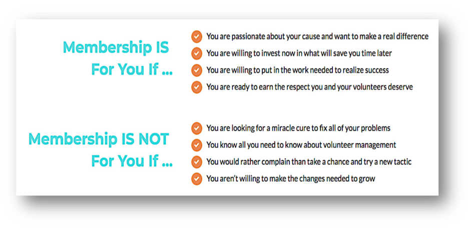
- The Real Deal – an honest assessment of who your opportunities are best suited for
Here’s how we’ve shared the real deal about VolunteerPro membership in the past. Note that we don’t sugarcoat things and we’re clear that for some folks, membership isn’t the right thing. You can decide how strong you want your wording to be, but this is your opportunity to clearly explain any common misconceptions about volunteering with your organization
3. “Nested” Information
Since volunteers will most likely be browsing your volunteer engagement page on their phones, creating a super long page that requires endless scrolling will be a surefire way to lose people.
To maintain interest, nest information by linking to deeper informational pages, instead of including all the info on your main volunteer recruitment hub page. Volunteers may still want to research deeper info, but it doesn’t have to be front and center. Here are a few pages you may want to create and link to:
- Success Stories – tales of transformation in volunteers and those they serve
- Frequently Asked Questions – to save space on this page, you can even nest FAQs so that each one opens when you click on it
- Volunteer Requirements and Application – a step-by-step process to apply with an “Apply Here” button
- Volunteer Opportunities – what’s open now and what each opportunity entails
- Find an Opportunity – find volunteer openings by entering a zip code; you could also list local neighborhoods
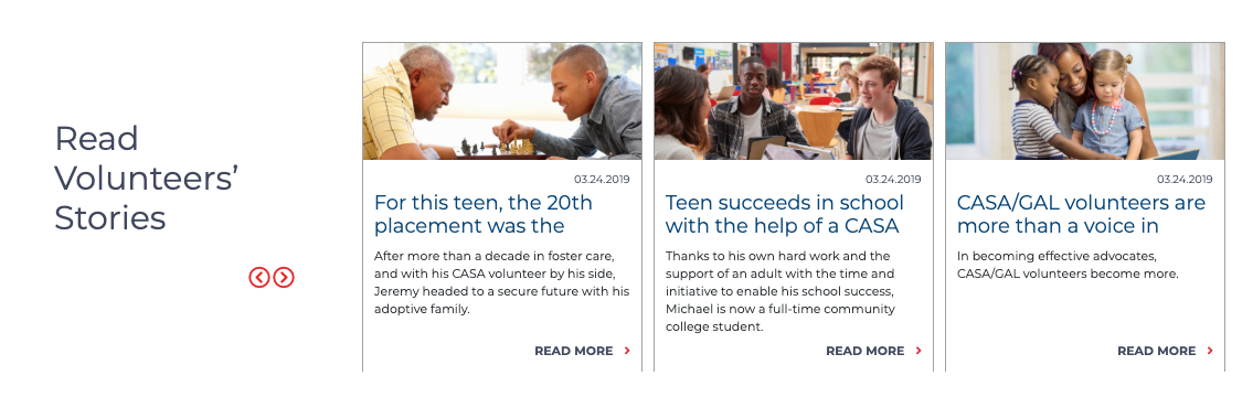
You can even spice up your nested information with images. Check out how the national CASA volunteer engagement web page does this with volunteer success stories below.
4. A Clear Call to Action
One of the key mistakes that nonprofits make with their landing pages is that they offer an “all or nothing” option for volunteers to engage with the organization. The choice is to either complete the application or leave the page.
But commitment is a process, not a destination. So, this approach leaves potential future interest on the table.
The fact is that many pf the prospective volunteers are browsing your page aren’t yet ready to commit to volunteering. So, it’s a good idea to offer information that they can takeaway to inform their decision making via an opt-in form (known as a “lead magnet” in marketing circles).
Creating an info kit for download by entering their first name and email address is an easy way to keep the conversation going. By collecting their contact information (versus posting a simple download link), you can begin to build a list of interested volunteers. Then, you can continue to send emails that educate and nurture an interest in involvement over time.
Better yet, offer a short worksheet or a short online quiz that helps volunteers decided whether your opportunities are right for them. Not a graphic design whiz? Use Canva to create a professional looking handout.
After you’ve sent a few emails, you might include a link that encourages them to return to your website and complete your application to join.
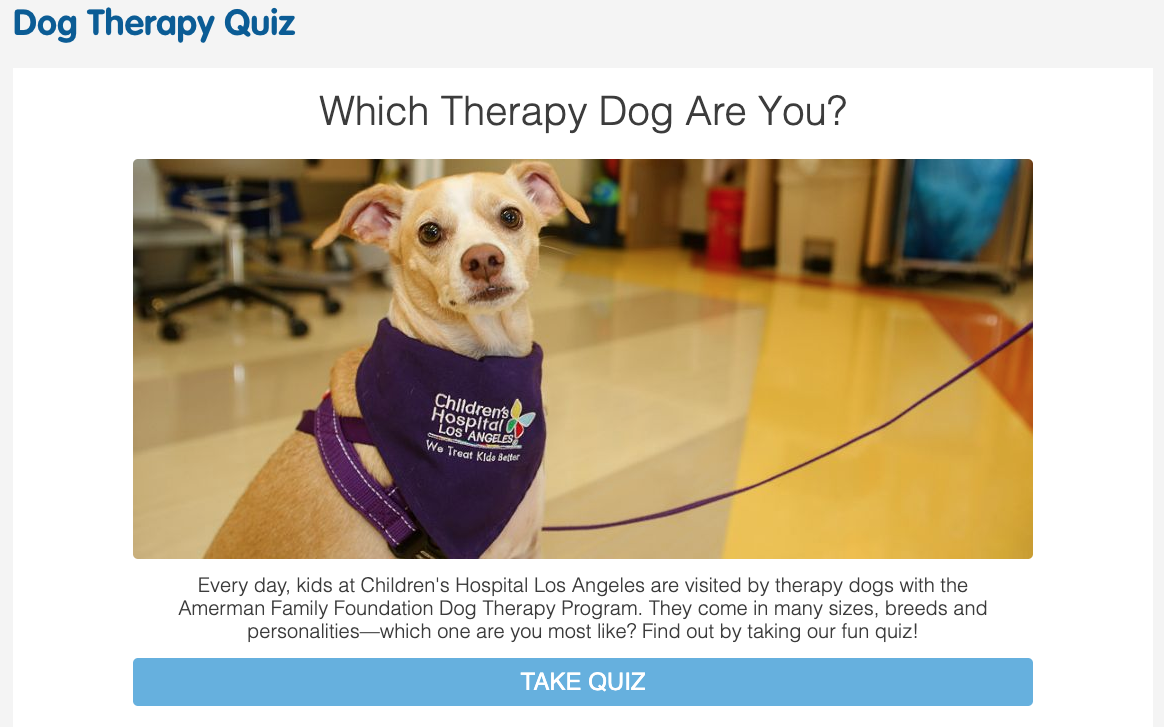
Check out the dog therapy quiz from the Children’s Hospital of Los Angeles. You could do the same with volunteers with a What’s Your Volunteer Superpower? quiz to generate anticipation and excitement and build a list of volunteer prospects that have shared their most important skills and interests.
These are only a few ways you can engage volunteers more effectively with a well-designed and purposeful volunteer recruitment page. To generate more ideas, ask your new volunteers. What helped them decide? What would they have liked to see on your website to help them with the process of joining? What confused them? What you learn will help you build a better user experience for your visitors and ultimately convert more supporters.
Remember, the volunteer website or page you use for recruitment is THE most important asset in your digital marketing toolbelt. So, don’t leave it up to chance.
Do You Have a Volunteer Recruitment Website that Engages Volunteers Successfully?
Do you have a volunteer website that you’re proud of? One that effectively converts visitors to volunteers. What that gets you traction?
If so, we’d love to see it! Post a web link in the comments below and tell us what you’re most proud of about the page.
Help inspire others by sharing your success!